Social Media Posts
I have had much experience in creating posts for social media accounts, both within Leeds Rock and Alternative Society and during my work placement within Whitehead Ross. Within this section of my portfolio, I will be specifically focusing on the posts made as part of my contribution to the Rock and Alternative Society at Leeds University, the design process behind creating them and their purpose. My other posts can be seen in the "WhiteHead Ross" section of my portfolio.
I have been designing all the social media posts for LUU Rock and Alternative Society since August 2024. See more of my work along with the reactions to those included in this portfolio on the official Instagram page:
Design Process
When designing for these Social Media posts I had to consider what the purpose each post had. This included if the post was for an event or an announcement along with what information was necessary for each post. Furthermore, I had to remember who I was marketing for when designing, with the society often using dark colours and gothic elements as this links to their role as a safe space for the alternative community at Leeds.
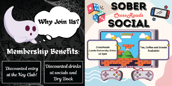
Why Join Us Post:
This post had the purpose of informing our followers about our membership that could be purchased off a website called engage. Here I advertised the benefits of buying a membership and the positives that people would gain. I used the colours black and white to link to the society and ensured that the text was easy to read and stood out. I decided to use a thought bubble to showcase the text to represent a common question among those interested in us such as "Why should I buy a membership?", which added to the design. I also made use of gothic graphics such as black lace and spiderwebs so the post would be seen as appealing to other members. For the post's main graphic, I decided to use a ghost as this could be seen as "cute" and help the Society seem more casual and less intimidating. It also continued to link to the representation of goth and alternative culture. This post is currently pinned to the Rock and Alternative Society's Instagram as it is both informative and appealing in visuals, allowing it to continue representing the society and its memberships.
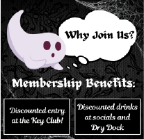
Sober Social Post:
This post had the purpose of informing our members about an event called the "Sober Social", in which our members would come together to play board/video games, have coffee or tea and socialise without the presence of alcohol. The key point of the event is ensuring that members are aware that alcohol and clubbing are not a requirement of the society and allow those uncomfortable around alcohol to also feel safe and supported. I was given a brief to make the post appear cosy and welcoming, meaning I decided to deviate from the usual black and white colour scheme of the society in favour of brighter pastel colours that better fit the post. I decided to make use of both bold and cursive fonts to make the design look textually interesting and made use of colourful graphics to help the post become more eye-catching. By using video games as the main graphic choice, I was able to represent the quieter atmosphere of the Sober Social over other events hosted by the society and am able to represent the vast amount of ways the society helps others to feel happy and welcomed.
Give it a Go Post:
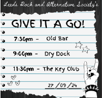
This post was created to advertise the Give it a Go event the society put on at the start of the academic year. The event had the purpose of introducing new people to the society so they could decide if they wanted to join. I had to put the correct dates and times onto the post to ensure the information was as accurate as possible so that new members could find us easily and avoid any confusion. When I began designing for this post I decided to take inspiration from phrases such as "Keep it in your calendar" by using hand-drawn typography in a notebook, as if someone is writing down the dates of an event. I did this to emphasise how people didn't want to miss the event and that it was a date worth saving. After this, I added hand-drawn graphics to the post to appear like a person is doodling in a notebook to add to the alternative style of the society. I continued with the usual black and white colour palette of the society and ensured that the typography "Leeds Rock and Alternative Society" appeared on the post to ensure audiences knew of the society.
One of the key parts of the design process of this post was the struggle I had creating it, as the notebook theme was hard to represent with the society's selling point of alternative and gothic styles. Because of this, my initial design for the post was thought to be too cute and not fitting with the society's themes, which I agreed with. This initial design can be seen below:
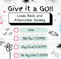
I was unhappy with the overall look of this original design and soon had it changed to have a darker background. I changed the fonts to be clearer and arranged the graphics in a more timid and less bold way to put an emphasis on the information displayed in the post rather than on the pictures and colours it contained. The overall result of these changes resulted in a post far more fitting of the society and that better provided the information members needed to be aware of all the details of the event being held.
Committee Introduction Posts:
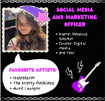
This post is part of a series of posts I designed for the society to introduce the new 2024-2025 committee that I am also a part of. This was done to humanise us and represent ourselves as real people to those considering joining, and so we can be identified easily by those who have never met us before and don't know who to socialise with. There were four key things I wanted to include in these posts: a photo of ourselves so people can see who we are, our role in the society, and other important information about ourselves and some information about our top three bands so that people have a topic they are able to discuss with us if they have never interacted with the society before. I decided to put the music section of the post in a speech bubble to represent our own thoughts and opinions about rock and alternative music to further represent us as real people. I made use of fun and colourful graphics that I believed fit the personalities of each member such as the shooting star that can be seen on my own post. I also ensured that each individual post had a guitar on it to emphasize that we are part of the rock music society to showcase a common interest among the committee. Furthermore, I made each post have a different colour scheme to make them all individually stand out. Because of the nature of our society, each post contained the member's pronouns to showcase that we are a welcoming community and to showcase us as an approachable safe space for people to join.
The Experience
The experience I have gained creating these posts has taught me a lot about design and listening to a team, especially when given criticism and being asked to redesign. It helped me develop important skills while working in teams and made me more ready to go into the world of work. I have created more social media posts than the ones included in this portfolio. Please look at the LUU Rock and Alternative Society Instagram and look at any work from August 30th to see more of my work as Social Media and Marketing Officer.